Each artist will probably use slightly different techniques for adding people textures to their perspectives. This is not really a tutorial but more of a series of tips for fellow architectural illustrators to help compositing people into architectural renderings. Its just one part of creating a good end result, but its worth devoting some time to this aspect of your illustrations. Below you’ll find a list of tips or reminders. Most of them might seem like common sense, but rather than simply cutting and pasting haphazardly, follow these tips and you’ll probably be happier with your image in the end. This is part one of my tips, and below you’ll find a few of my people textures which you can download for free and use in your illustrations. In part two I’ll show you a trick I sometimes use to quickly blend and harmonize people in an illustration. Happy compositing !
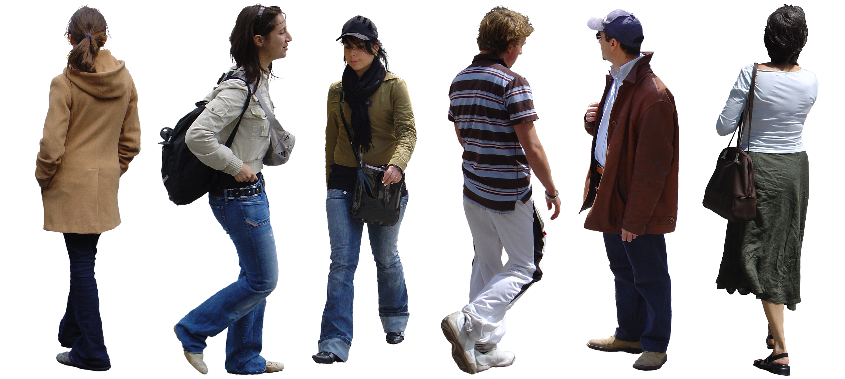
People Textures
Scale
It can be difficult to get your people textures at the right scale in your architectural illustration. If you’re not good a doing this by eye, then a good trick is to insert a crowd of lowpoly 3d people into your scene and do a quick render. You can then use this image in a separate layer in Photoshop while you’re compositing your people. (or trees, cars etc.)
Context
Does the person fit the context of your image. Its self-explanatory you’re not going to put a man in jeans and a T-shirt into a formal business environment, but you should also review the persons pose, and whether they fit naturally in the location you’re trying to put them.
Lighting
Compare the lighting in your illustration with the lighting of your people. For example, people textures that are sharply lit will obviously fit better into a sunlit area of your illustration, but take note of the direction that the light is coming from as well. If you need to put a brightly lit person in a shaded place in your perspective, modify its ‘Lightness’ value in PS so it fits better.
Color Harmony
I believe colour harmony is important when compositing people with an architectural illustration. What I mean is that the colour of the clothing of your people should be in harmony with the colours in your rendering. This is important because what you’re trying to show off is the architecture – not the people. If your people textures represent a psychedelic rainbow of colours, then that could distract the viewers eye somewhat ! You can either desaturate the people so they don’t catch the eye, or add color to specific people to harmonize with the rest of the image.
Color Correction
Not the same as colour harmony, but has a similar intention. Your people textures may have a red hue to them, but your architectural illustration has alot of blue tones in it. For a more convincing result its good to colour correct your composited texture to match the colour tones of your image. The same comment is valid for the people texture’s saturation. Not only is the result more convincing, but it also means that your people will not stand out, and detract the viewers attention from the architecture.
Blending Modes & Transparency
Once you’ve pasted your people into a scene, don’t just be happy to leave them in their original state. Play around with the layer blending modes, change their transparency, blur them, even make a clone of the layer and apply different blending to each layer. If you just leave them in their raw state, most of the time they won’t look like they blend with your image. Playing around with the layer modes or adding a little transparency can help create a better harmony with your architectural illustration.
Composition in Space
Should that person really be there ? Make a judgement on the composition of your people within the scene. Move them around until they look right, and so that they don’t diminish an important architectural aspect of the view.
Shadows and Reflections
Pretty straight forward, but don’t forget to create shadows and reflections of your people textures if necessary – it helps them sit better in a scene.
That’s all folks 🙂
Leave a Reply